Tutorial 7
Sometimes maps do not only show physical points, boundaries, and flows: graphs and statistics are added, and some elements may be added in order to emphasise a particular point. This tutorial will show you how to display population circles within a physical map – a classic from your geography classes at school!
We will use the case of the Adresaro (Esperanto speakers) in Europe in 1905. Special thanks go to Josh Sherrington whose undergraduate research essay inspired this tutorial.
STEP 1: INSERTING THE DATA TO THE MAP VIA A CSV LIST
The data was collected in Peter G. Foster’s The Esperanto Movement (The Hague, Walter de Gruyter, 1982). It was put into a CSV list (tutorial 2 explains how to do so): the list is composed of the country name, the number of Esperanto speakers, and the coordinates where the population circles should be centred.

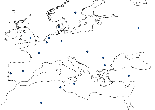
Once inserted into the map, the data seems standardised: there are no labels nor varying size.
STEP 2: MAKING CIRCLE SIZES VARY DEPENDING ON POPULATION
We want the biggest Adresaro settlements to display the widest population circles. To do so, open the Style properties of your data layer (Right click > Properties > Style). In the bottom-right corner of the window, click on Advanced.
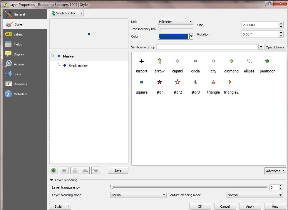
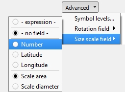
In the Advanced option, select the Size scale field tool. Select according to which field the size of your circles will vary (in our case, Number).
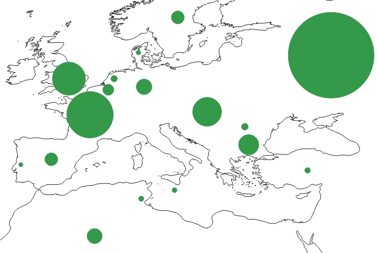
After clicking OK, the result should look like this.
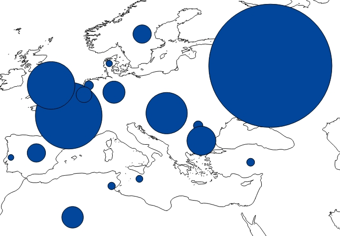
This is starting to look interesting! However, some of the circles seem so big that they overlap with others. To avoid this, we need to lower the original size of our dots. Go back to Properties > Style, and play with the original size of your dots (under Size). You may also change the colour of your circles.

I have lowered the original size to 1.00 and chosen a green colour.
STEP 3: ADDING A LABEL WITH BOTH NAME AND DATA
One final element is missing: labels. We have already learnt how to insert labels onto a map. However, since quantitative data is key in this map, it would be nice to display both the name of the country and its number of Adresaro. Open Properties > Labels. Instead of selecting which field should be labelled onto the map, click on the icon on the right.
![]()
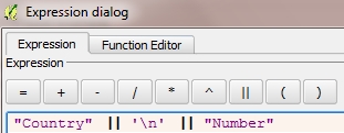
This will open a query box that is similar to the one we saw in our previous tutorial. Here we want the name to be displayed first, then the number of Esperanto speakers just underneath. To add more than one value, we are using the formula ||. To allow multi-line labels, we use the formula ‘\n’. Your full formula should therefore look like this.
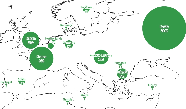
After also changing some of the Style settings of the layer (font, size, colour, buffer, position), the final result should look like this.
Last update: 4 June 2015 on QGIS 2.8.1 Wien.